Day one review of the 15 Pro Max:
In short, yeah, it’s good.
The dynamic island is way more of a benefit than I expected it to be. It certainly wasn’t the only possible way to accomplish this, but they made things like phone calls more unobtrusive (the old active call dialogue obscured much more of the screen) and things like background audio much more accessible. I thought it was a gimmick when it came out, but after using it, I will never for a moment miss the old way.
Similarly, the “action button.” In ring/silent mode, it’s fine. The haptic is identical to the old switch, and given the cases I keep it in, this is actually less likely to be switched accidentally. But I was able to set it to voice memos instead, which is something I’ve wanted easier access to for a long time. It’s not “huge” but it’s definitely a positive, and yes something where it’s worth accepting change.
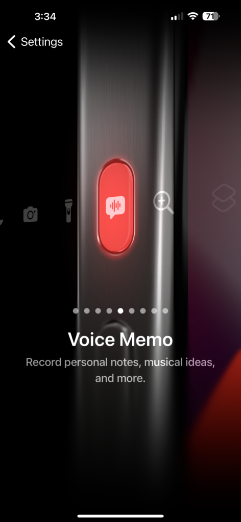
Update since initial draft: oh my gosh. I love it. LOVE IT. Taking a voice memo with my iPhone is now even easier than with my Sony recorder. This is huge and I am gleeful about it.
It is quite funny to see the full circle on this. Apple started out leading the industry with minimalist controls. The original iPhone was talked about as having “just one button” but that was never true. It had four buttons and a switch. It’s just that, even the other touch screen phones all had at least two additional buttons past that back then. Apple got some flak for de-buttoning further, first with the non-physical button on the 7 and up, then with eliminating the home button with the X. This is kind of a backtrack in that rather than reducing the control count, they are increasing the versatility of the same control count. This is surprisingly un-Apple. I’m used to them saying “this is how we think you should do things, and we think you’re gonna love it,” not “have a handful of choices and a scripting tool to make those options infinite. Sorry we took away a thing you liked to trade it for all these options.”
The size does suck to handle. My thumbs are in pain. Mind you, that’s been going on anyway but this is not making anything better. However, I must grudgingly admit that web pages including Facebook are sometimes easier to read on the larger screen. I do worry it’s a step backwards for ebooks, where the smaller screen helped me with my dyslexic tendencies. But for web pages and apps that are overly cluttered in ways the user can’t turn off, the larger screen mitigates the clutter somewhat.
The move to titanium couldn’t be more welcome. The needlessly heavy steel frames felt like Apple being passive aggressive. We said “please stop making compromises we don’t like in the pursuit of needlessly lightweight phones.” Indeed, the iPhone 6 was too thin and light, and the battery and durability compromises back then were unacceptable. But that was now ten years ago. With the iPhone X and “surgical steel” they went to another absurd extreme of phones that instead of being comically flimsy and needlessly delicate, were needlessly heavy for no real consumer benefit. This new titanium frame is the compromise we should have had when the X came out. A needed course correction. Not needlessly heavy like the steel, not needlessly flimsy like the aluminum foil the built the 5 and 6 out of.
I haven’t really had a chance to test the camera yet. That will happen on the river soon. But that was my main reason for the upgrade, to get better medium telephoto shots without having to haul a big dedicated camera.
The satellite SOS remains an interesting and welcome safety feature, but as implemented is not remotely close to being an Inreach replacement. That’s an infrastructure thing. Apple is correct on this. If they tried to roll out an affordable casual use satellite texting plan, users would instantly overwhelm it, and there isn’t a market solution to that beyond what they have done as is. They could price it at a thousand dollars a month and there would still be enough users to overwhelm the network. So I’ll keep separately paying for and carrying an inreach when I need regular remote coms, but it’s nice not to have to “just in case.”
Similarly, I haven’t fully tested the other new killer feature of the high speed USB port. I’m looking forward to testing that after a photography session, but haven’t had that chance yet. I did test copying a single large file through it and it seemed to work fine, but I was troubled by the lack of a clear progress bar or similar upon the import.
I did have a frustrating experience with the eSIM activation, but that was on Verizon, not Apple, and was pretty easy to resolve. The speed and reliability of the device transfer utility could certainly be improved – I was basically offline for over two hours because of it – but it did in the end accomplish the task decently.
I’m still frustrated that they didn’t raise the top storage option, especially in light of the camera and USB upgrades. I really would have liked a 2 or even 4 terabyte option here, but to be fair to Apple nobody else seems to offer more anyway.
On the whole I’m giving this an impressive 80% score, which according to the 80/20 metric is actually a perfect score relative to corporate America. It’s not 100% for me but I’ve scoured the market and in this area as with most other areas, this is as close as I can get without spending six figures on custom engineering.
Leave a Reply
You must be logged in to post a comment.